Branding, Packaging + GTM Strategy
What It Is.
The intial work done for the launch of a new entrant—aimed at older, more mature cannabis users—in Missouri’s burgeoning cannabis market.
Specifically, the branding and packaging work submitted to the Missouri Department of Health and Senior Services for approval.
Why It’s Here.
Orange may not be the new pink, but cannabis is the new alcohol when it comes to legal adult mood shifters.
I jumped at the opportunity to gain experience in this fast-growing industry and continue to develop my insight into the vast spectrum of consumers, how they intersect, and what motivates them.
So What?
The brand is headed for a spring 2024 rollout with a solid team behind it—including established cultivators, dedicated investors, and a small team of brand marketing professionals with decades of experience in the beer and spirits industry.
Uplife Logotype + Cannaburst™ Icon
Custom cushy, cloud-inspired letterforms and a blooming burst of positive goodness.
Gummies
Sample: Key Lime Pie
Satin finish stand-up zip pouch with tear-off top strip.
Per guidelines, each package is allowed three colors. The final colorway shown on each may be revised to ensure holistic harmony across brand and form verticals.
Bites
Sample: Dark Chocolate
Satin finish stand-up zip pouch with tear-off top strip.
Tablets
Sample: Indigo
Black child-proof pill bottle with satin finish label. The bottle will come in a box as secondary packaging
The Tablets are meant to be swallowed, so will be identified by their color as an indicator of the effects the five different Tablets will have.
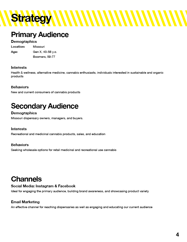
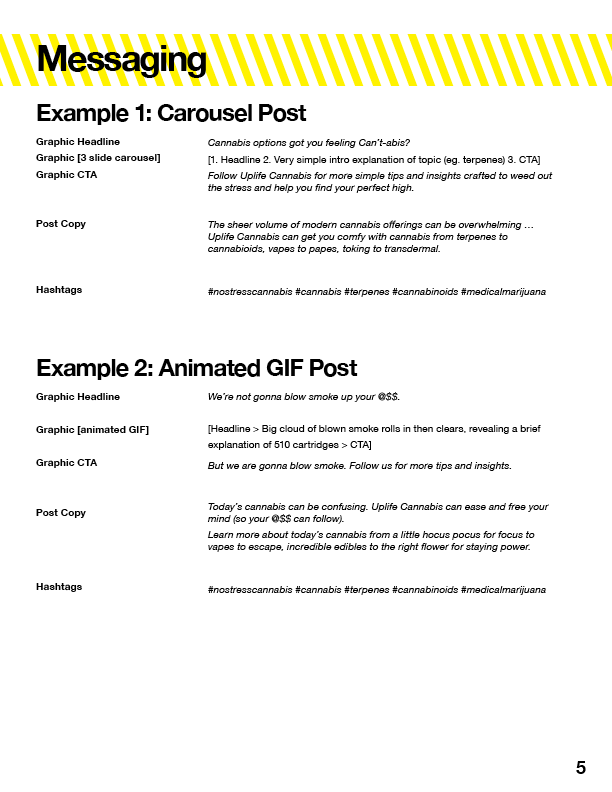
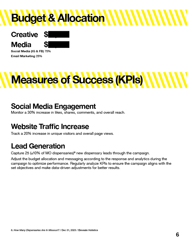
Go-to-Market Strategy ⇢
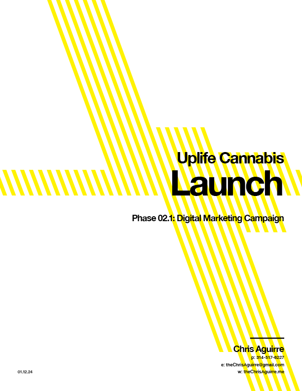
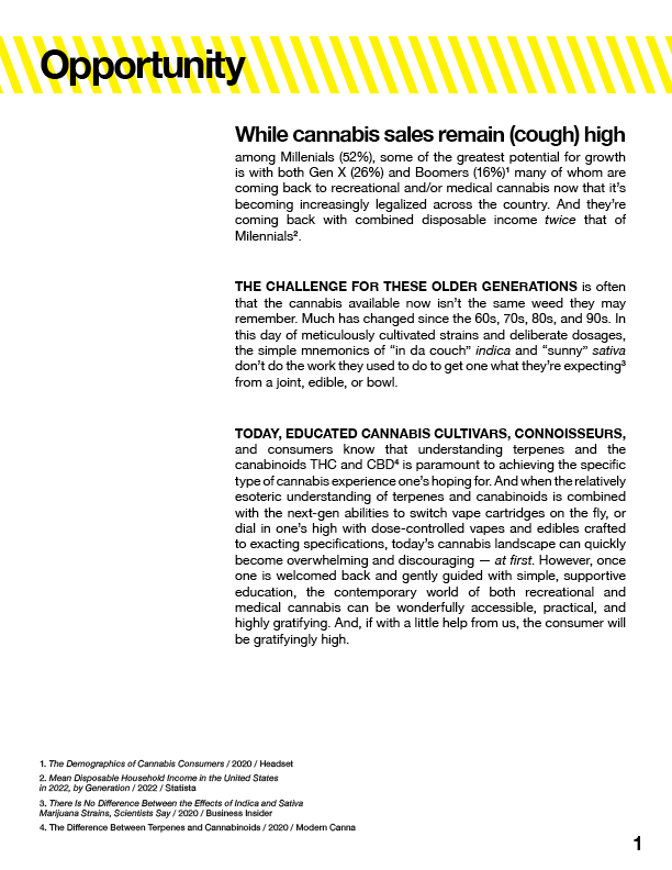
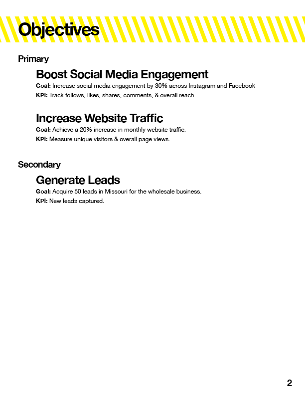
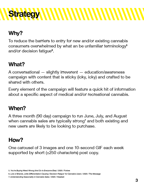
A sample of some of the work I’ve done thus far to help position and market the new Uplife brand in the evolving and competitive Missouri cannabis landscape.
⇠ Brand Refresh
Along with the Uplife branding, I also updated the primary branding* of MidSouth Extracts, the cultivator supplying the cannabis.
*From clip art. 😬


