

Brand Refresh + Reinvigoration
What It Is.
The first cohesive brand refresh this agency had had in over five years.
And, an effort to impact the mission, culture, and ethos of the agency itself.
I blew it up, stomped around in the detritus, (as represented by the lo-fi clip from the “new site soon” teaser video above), and then began putting it all back together one piece at a time.
Why It’s Here.
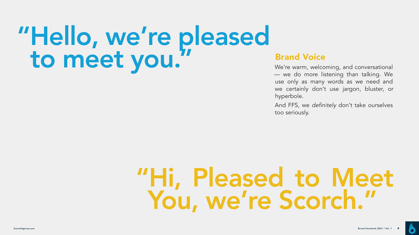
I came in as the Executive Creative Director with the intent of not only giving this agency brand a more au courant sensibility but to refresh its somewhat tarnished image and reputation with my own. I took the existing tracks and produced a remix if you will (and even if you won’t).
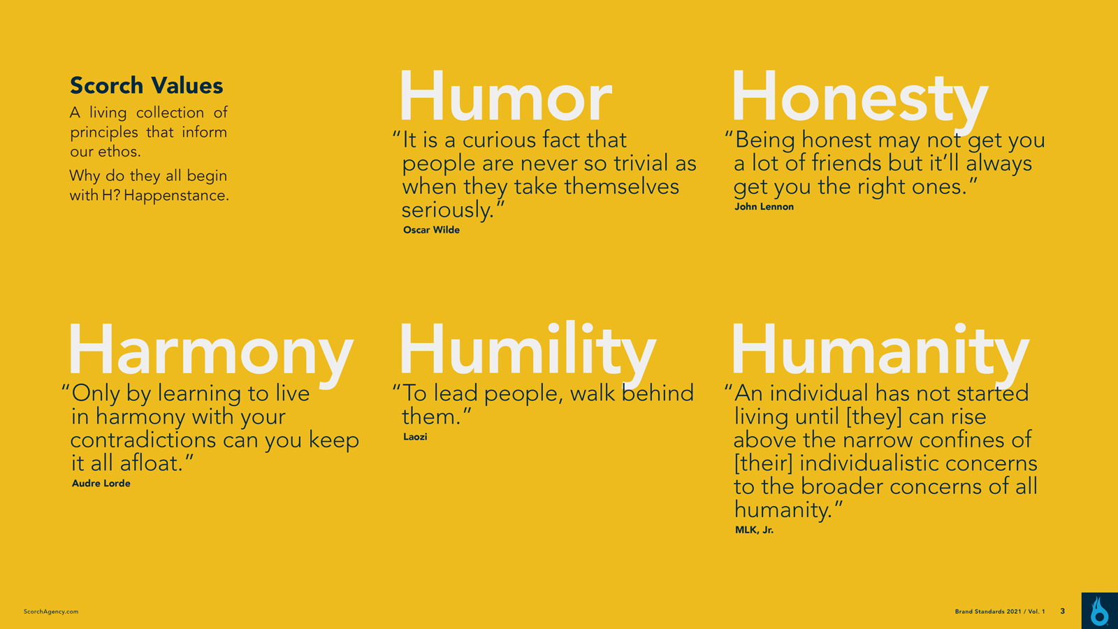
The idea was that the style guidelines be a sort of open-source living blueprint that would allow for others to “add a horn section” or “more cowbell” if ever deemed necessary.
First, a small team and I stripped away the extraneous elements that had accrued: overreliance on “heat, hot, burn” language, gratuitous 3D shading on the icon, a bloated palette, unfocused typography usage, etc.
Then we made some simple, quick edits to what we were keeping: redrew and kerned letterforms, developed simple guidelines for illustration and photography, refined and defined the palette, and loosely outlined a consistent, conversational voice.
So What?
“Your efforts are definitely working —my phone is ringing off the hook with people who want to know more about working here!”
— Proofreader, Scorch
“An appreciation for a well-written and human job posting. Leading with honesty and mentioning new hires by name. Nice work.”
— Creative Director (different agency)
“Really enjoyed working with you on this — thanks for the collaboration. It’s an artwork.”
— Senior Director of Strategy, Scorch
“This is bigger than a lot of agencies we work with in NY and LA.”
— Industry DEI Leader
“I love the real, conversational tone of the site. So much nicer than the typical agency grandstanding.”
— (A different) CD (from a different different agency)
“Thanks for promoting such an open and welcoming environment for all.”
— Video Producer/Editor, Scorch

Refresh Your Brand Like Nobody’s Watching;
Tweak the Style Guide Like You’ve Never Been Hurt…
We began with a “live” refresh of the brand. I like to iterate live when I can and evolve in plain sight. So, we crafted the site live and figured out the brand elements while we did it.
Flaming Os & Sunrises
To alleviate the heavy lifting that the Flaming O mark had been doing for over a decade, I focused on the palette — including a sunrise-like gradient — and the voice.
The illustration approach that we worked out in other collateral was slated to show up on the site soon.
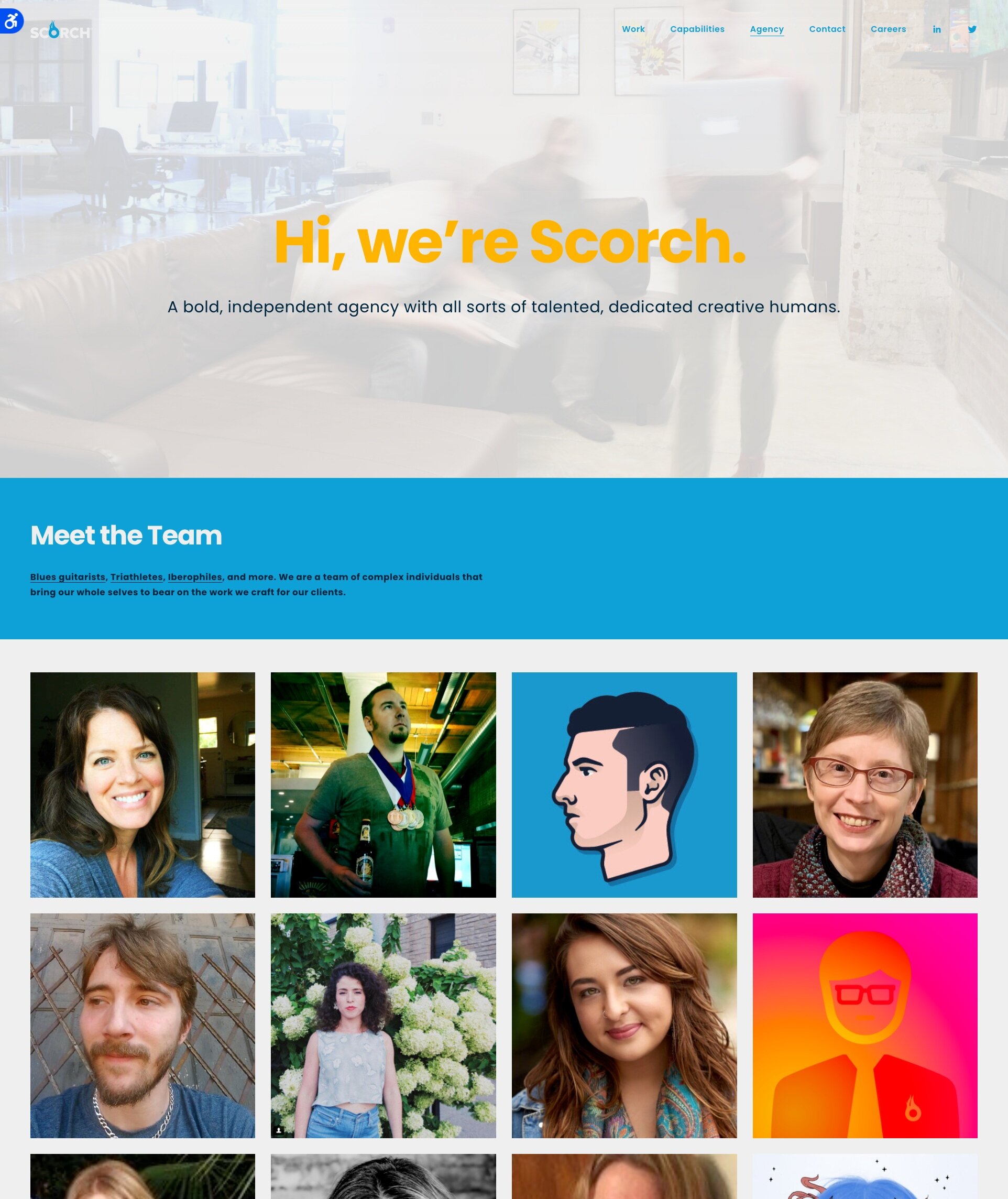
None of Us Is As _________ As All of Us.
The refresh was not only cosmetic, it was vital to refresh the principles — and actions — of the organization as well.
It was critical to me that everyone in the agency felt represented — not just as invaluable contributors to the organization, but as their whole selves.
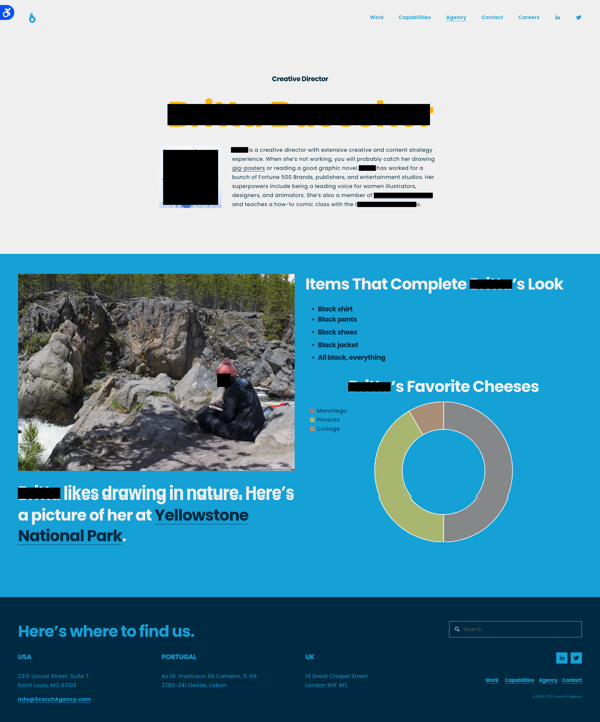
Where once only the C-Suite had been represented on the website, now everyone was included — and, with no obvious titles or hierarchy, the visitor must click through to learn more about the individual’s role in the agency and about the person.
And, when updating our email sigs, I made sure we led with our pronouns. A small effort with big impact on supporting all in feeling seen.
Diversifying My Portfolio
As the primary recruiter during my time there, and de facto DEI lead, I co-founded F.I.R.E. (the Fellowship for Inclusion, Representation, & Equity) an internal BIPOC / LGBTQIA+ intersectional allyship and instituted diversity reporting.
Note: This section on the Agency page was intended to be updated each month. I was at Scorch from January 4, 2021, through June 30, 2021. Draw conclusions at your own discretion.
Not Your Standard Brand Standards
As noted in the new style guide there is now not only the Flaming O mark but a legit FlamingO mark.
These pages from the concise style guide give a quick sense of the style, voice — and, ahem, vibe — I hoped to display and encourage.