

Name, Marks, Iconography, Type, Digital, Print, Video, UI, Swag + More
What It Is
Beginning with a new name, this was a complete rebrand of a global mobile tech startup.
Why It’s Here
Because, despite limited time, budget, and resources, (both human and logistical), I’m exceptionally proud of the comprehensive identity I delivered to position the rebranded organization as a serious (with a wink) category-leading, world-class B2B2C mobile tech company.
So What?
“Wonderful job! … I’m bursting with excitement and couldn't be more proud (of the rebrand).”
– CEO
“Fantastic!”
– CMO
“Well done!”
– Chairman of the Board + Lead Investor
How It Started
2018 The branding the founder launched with.
Mo… Cha? Mo-Cha? And an arrow? A stylized rotated M? We will likely never know — the rationale is lost to time.
How It Restarted?
Late 2021 Agency work done weeks before I was hired. Here with slight edits subsequently made by me. Specifically, a customized logotype font to replace the supplied typeset logotype.
Still with a name based on a whim of the founder’s that the company struggled to explain. BUT! Now with a rainbow pinwheel … with a star at its center.
How It’s Going
2022 The foundation of the new identity …
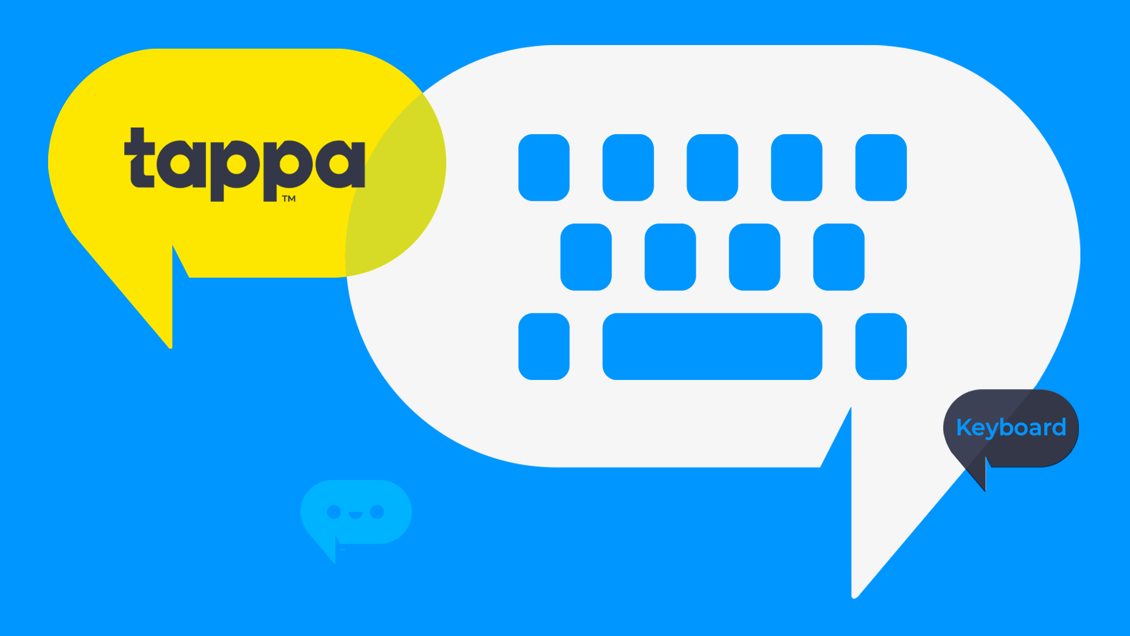
A new name informed by how what it is, an app, and how one interacts with it (i.e. tapping), taper (“to type” in French), and tapa (colloquially, “appetizer” in Spanish), that resonates with a global audience.
Expressed via a logotype constructed from a completely redrawn proprietary geometric humanist font, and the welcoming familiarity of the Tapplet icon.
Naming was, without a doubt the most challenging and time-consuming part of the process. We went through multiple rounds that explored different naming systems, taxonomies, and conventions.
App Appeal

We used our own Tappa app as a proving ground to develop App Store Optimization (ASO) best practices for our partner’s apps. Through regular iterative A/B testing, we tweaked our mobile app’s listing in the Apple App Store and Google Play Store to increase its visibility and convert users. We optimized for icon, title, description, keywords, and visuals to enhance in-store discoverability via search to boost our app’s ranking and downloads.
It’s Written All Over Their Faces
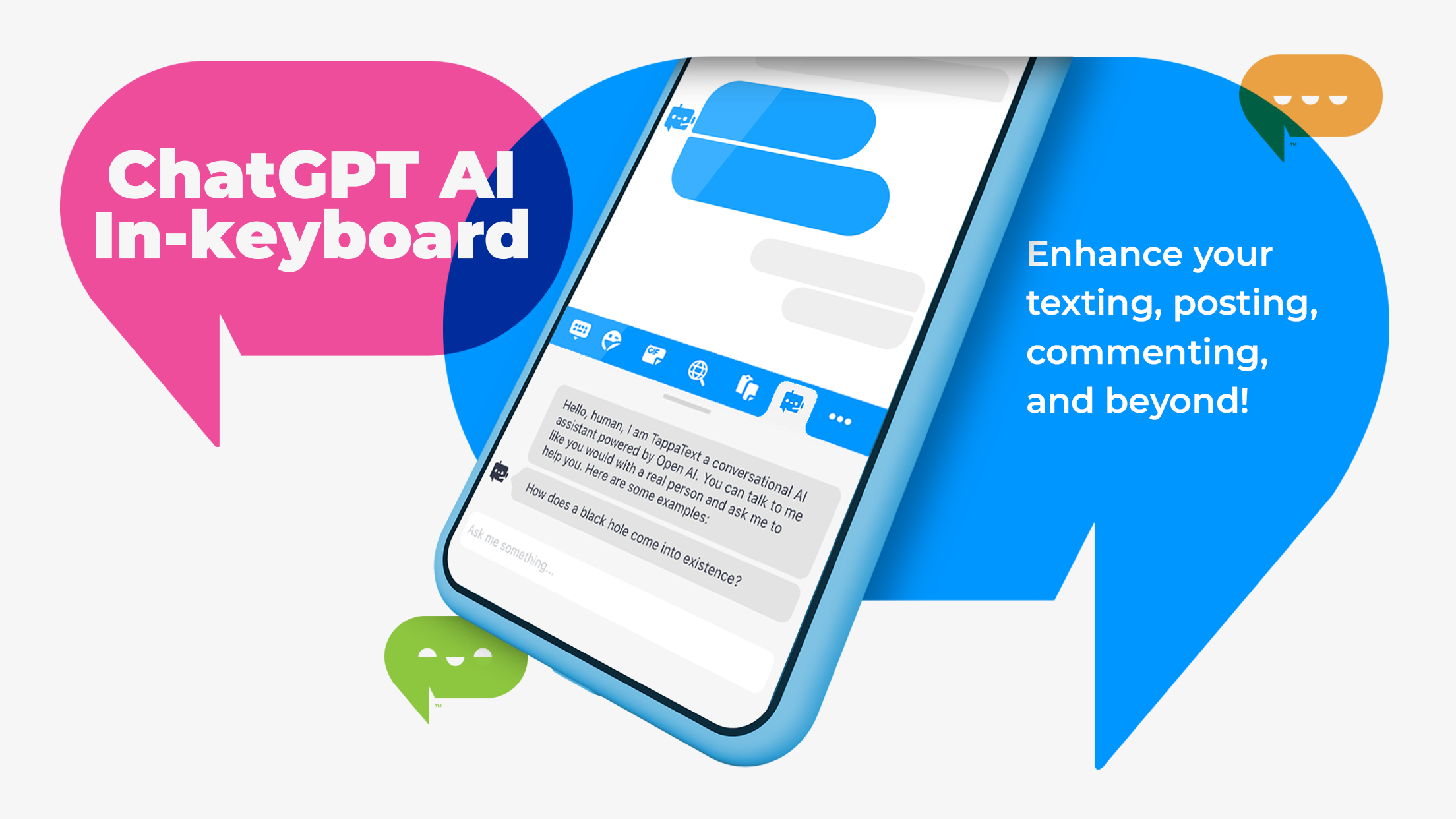
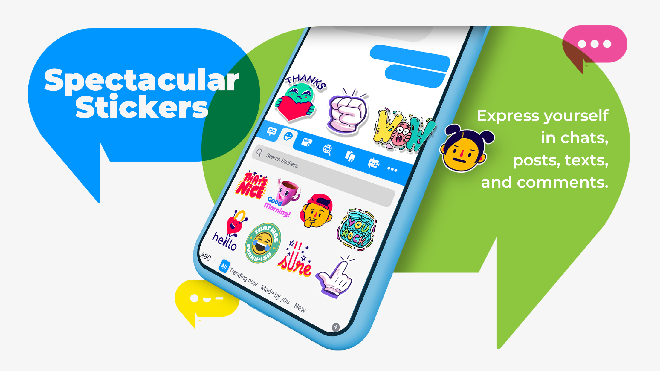
The family of Tapplets was conceived to allow Tappa, as a global brand, to tell brand stories from various perspectives to diverse audiences. Like emoticons and emojis before them, Tapplets were designed to quickly and concisely add a spectrum of emotions and feelings to Tappa brand communication … and transcend any language barriers. Even the standard, oft-dreaded “_____ is typing …” 💬 bubble becomes a Tapplet wide-eyed and open-mouthed with anticipation.


Integrated Social Marketing
A small sampling of the Social Media creative featuring the suite of UI iconography I designed, the branding for TappaText™ (the keyboard’s integrated AI-powered chatbot), and one in a series of “Meet a Tapper” videos.
Tappa.com
After a relatively subdued early stage as Mocha Global, we recognized the need to make a bolder impression. The goal was to create a more expressive, vibrant, and engaging brand to captivate our audience. So, on a tight schedule and tighter budget, I completely redesigned and rebuilt our site to reflect the vitality of our new brand and organization.
The new website featured a vibrant color palette, parallax scrolling, and an animated Tapplet on each page. These elements helped us convey a sense of vibrancy and energy that was previously lacking. Additionally, we took the opportunity to showcase our entire organization on the site, which I believed was essential for building trust with our users. Click on the images to expand and explore each of the main pages.
Note: Since my departure, the current site (along with most, if not all, other brand creative) has been updated without adhering to the style guide.


